Do’s and don’ts of picture hanging
Edward Bulmer Natural Paint is the official paint partner for our exhibition Gwen John: Art and Life in London and Paris.
We asked Edward, architectural historian and interior designer to share his insights on hanging pictures, drawn from his 30 year career working in some of Britain’s finest buildings.
“Just as ‘manners maketh man’ I believe that ‘hanging maketh rooms’!”
With exceptions like the presence of Chinese wallpaper or mural decoration, walls always look better with pictures. It is worth remembering that in early times images were used almost ‘instead of walls’. Tapestries would be hung floor to ceiling and in panelled rooms some or all of the pictures might actually be built into the joinery. This was the root of the sense that pictures had an architectural presence as much as a decorative or didactic role. Just as the mouldings in the room, like cornices and skirtings, look better when their proportions are ‘right’ for the scale of the room, so the mass and massing of pictures needs to relate to the proportions of the wall.
For instance, the wall face between these mouldings will appear square, portrait or landscape in shape to the eye. Your pictures will generally appear in the same way, so if you hang an upright portrait in the centre of a landscape shaped wall you have a conflict, which you can resolve by hanging pictures (maybe in tiers) to either side so that the combined picture ‘shape’ becomes landscape too.
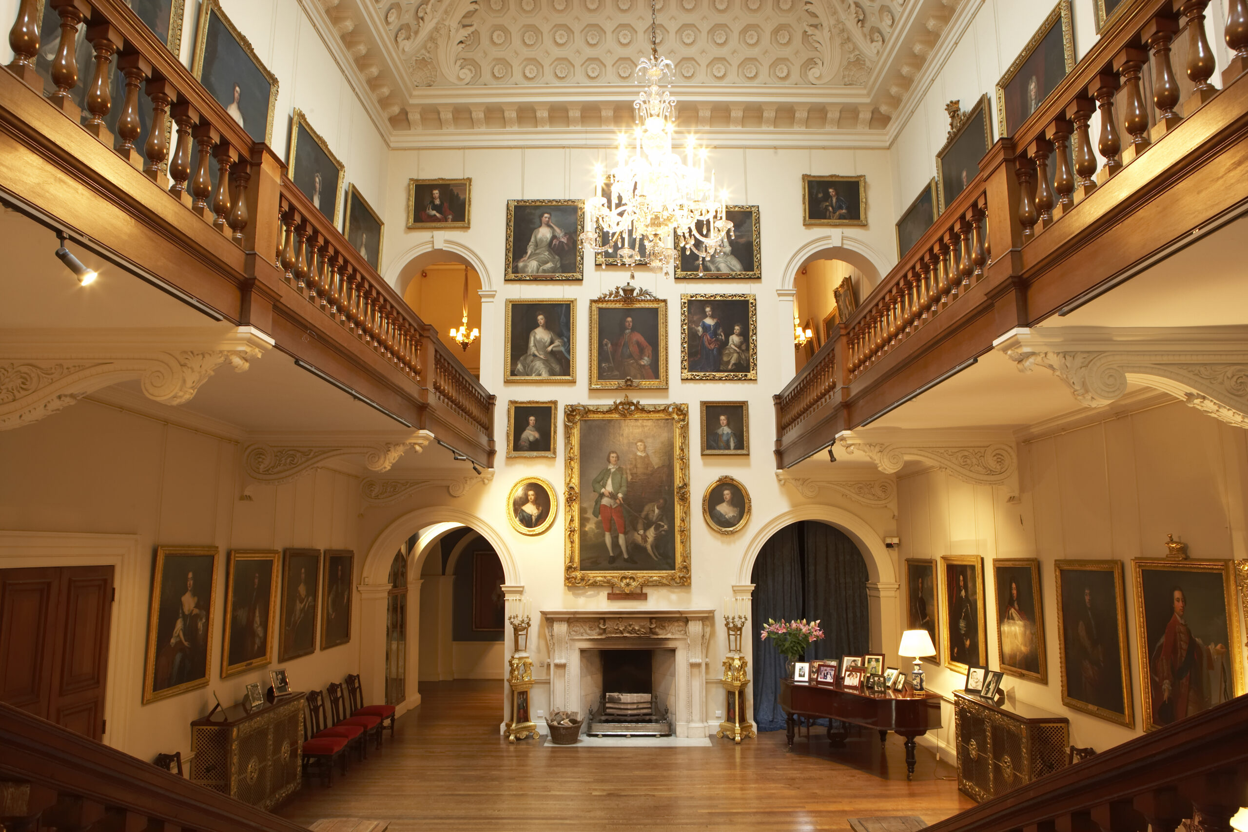
The grouping of pictures can be done symmetrically or asymmetrically, but the latter will feel more comfortable if the weight of pictures is roughly balanced either side of the centre line. If I am hanging a group of watercolours or prints in a group. I will mark out the wall size on the floor with two extended tape measures and then arrange the pictures before hanging them. Groups of pictures are best hung on two fixings each to avoid you spending the rest of your life straightening them!
In a country where we have so many houses that have been lived in by multiple generations we see the effect of collections of pictures growing and contracting, of influences coming from Court, or from foreign travel or from engravings. This has to some extent shaped our expectations of the choice, scale and age of pictures suited to different types of rooms.
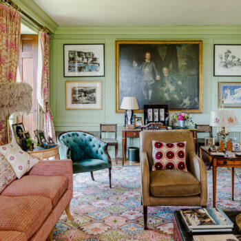 When it comes to mixing different periods or styles, few people remark if a Holbein is hung with a Holman-Hunt or a Lely with a de Lazlo (other than how lucky to have the ability to do so!) but they are 400 years or so apart. So it should not really be too hard to imagine hanging Turner with Tracy Emin whose work is only 200 years apart. The point is, to hang works of commensurate quality. Lucian Freud, Sargent and Gainsborough have been hung together at Chatsworth and are just part of a room that feels right because attention has been given to combining furnishings of similar design status or historic resonance. Though few have the pocket to be able to emulate this, we can all mark the lessons.
“My approach has always been to hang the most special, the most treasured, the most enjoyed pictures, in the rooms you spend most time in.”
But what happens when that is the kitchen or your bathroom? Choose carefully – maybe use glazed frames in these areas or pictures that are more for decorative effect than connoisseurship. Similarly, hang less appreciated pictures in less visited spaces or those you don’t dwell in – they can still have some decorative, or even dramatic, effect and pictures are always best hung on walls, not stacked on the floor.
Make sure your pictures mean something to you, whether you are buying or selecting from old family pieces. Give your best picture the best position. This is one of two places usually – over the fireplace if you have one, or on the walls with a side light. Hung opposite windows or in rooms with strong pendant lighting, pictures are remarkably difficult to see. Picture lighting has progressed enormously in the last decade, with the advance in LED technology. It is energy efficient, low UV, dimmable and capable of good colour rendition. Lighting can be frame mounted or in the form of directional spots and bought off the peg or supplied by specialists.
As with choosing colours, there are a few guides when hanging pictures:
- Choose pictures that occupy the wall space well and hang them centrally between the architectural features of the room.
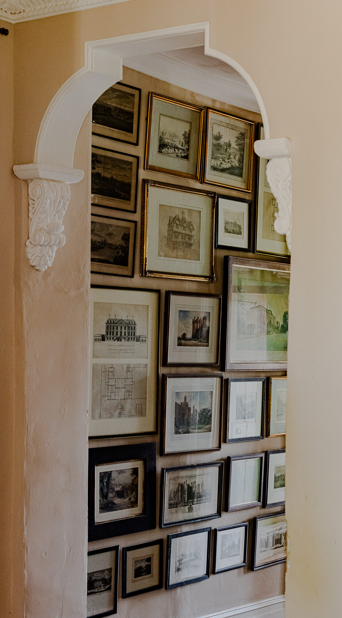
- It is the convention to hang larger works over smaller; when hanging in tiers, it makes sense as smaller pictures are generally more detailed and need to be nearer to eye level.
- Use picture rails when you have a lot of pictures and may want to move them around. Heavier pictures require brass or iron rods, or if you want less traditional there are steel and aluminium systems.
- Don’t put pictures of unequal visual weight together, like a carved and gilt framed oil over a thin wooden framed print.
- Framing is really important – the right period frame on an old work makes a huge difference. Framed and unframed works don’t sit that comfortably together.
- Try to achieve a big mass, or massing, in the centre of the wall and flank this with smaller pictures.
- If trying to achieve a random wall to ceiling and side to side mass hang, lay your pictures out on the floor first and play around to get the right arrangement and balance, before hanging it.
- If you don’t have a good enough picture to go over the fireplace, or it is opposite the windows, use a big mirror.
- If you are hanging groups of pictures, try to achieve an undulating line to the tops of the frames with one answering another, rather than lining the tops through (or the bottoms).
- Choose quality and subject matter that is complimentary. Each picture should gain in the other’s company.
- If preferring to have one picture on a wall think about the negative space around it and make sure that the picture outweighs it. This is usually easiest achieved by choosing a picture that is at least a third of the size of the wall and preferably half the size.
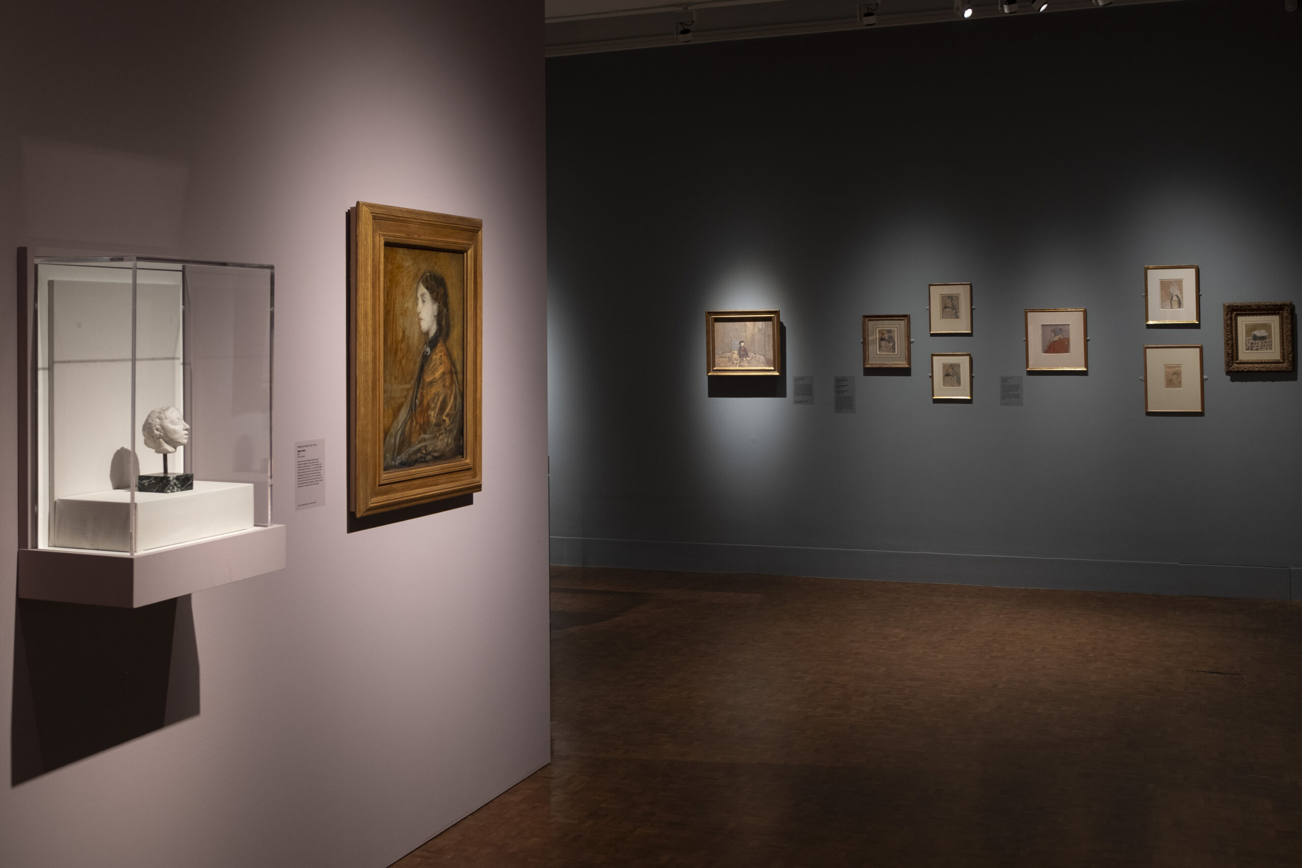
For our exhibition Gwen John: Art and Life in London and Paris, Edward Bulmer selected Cerullian Blue and Lavender from his Natural Paint collection, which provide the perfect backdrop to the paintings and works on paper. Read more about the exhibition, which closes on 14 April 2024.
